B2B sales don’t usually happen through conversation. Telepass wanted to change that, using an AI agent to guide prospects through their business offer on a landing page. I led the design end to end, from mapping the qualification flow to defining a visual language that made it clear this wasn’t just another chatbot.
Telepass Chatbiz: selling through conversation.
Client
Telepass
Year
2024
Type
UX/UI Design, Conversational AI


The challenge
Anyone can build a chatbot.
The real work was making sure users would never think that's what this was, through the flow that guided them and the visual language that surrounded them.
The process
Designing for unpredictability.
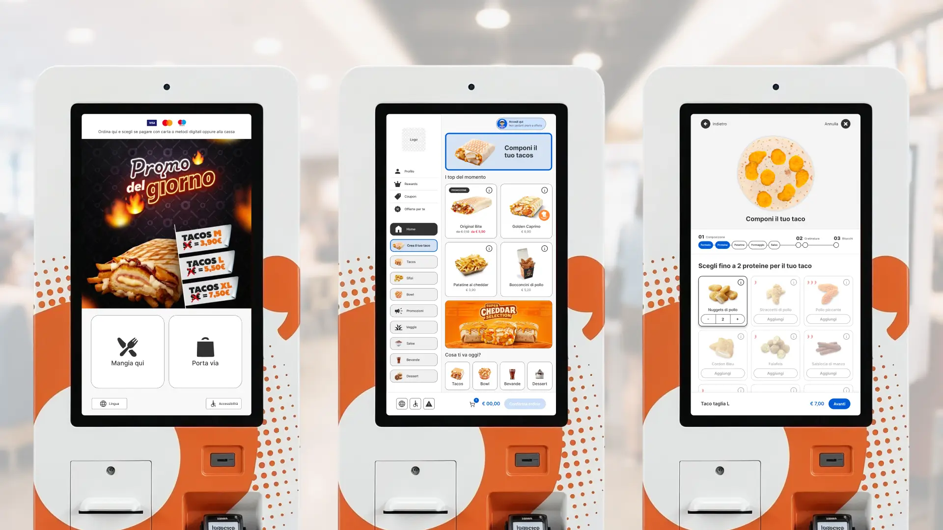
The project started with mapping the qualification flow: a guided conversation that routes users either to the AI agent or to customer support, based on who they are and what they need.
Getting that logic right was the foundation. Once the structure was solid, a different kind of problem emerged: the output is never the same twice, so the interface had to work as a frame, not a script.
That became the lens through which every decision was made.


Quick replies as guardrails.
Quick replies weren’t just a UX shortcut. They kept the conversation on track in the early steps, unlocking free input only once the user was properly qualified.
Beyond the landing page.
The same agent was integrated as a widget inside the subscription flow, to support users who dropped off because the process felt too complex. Same system, different context.
The interface
An AI that looks like one.
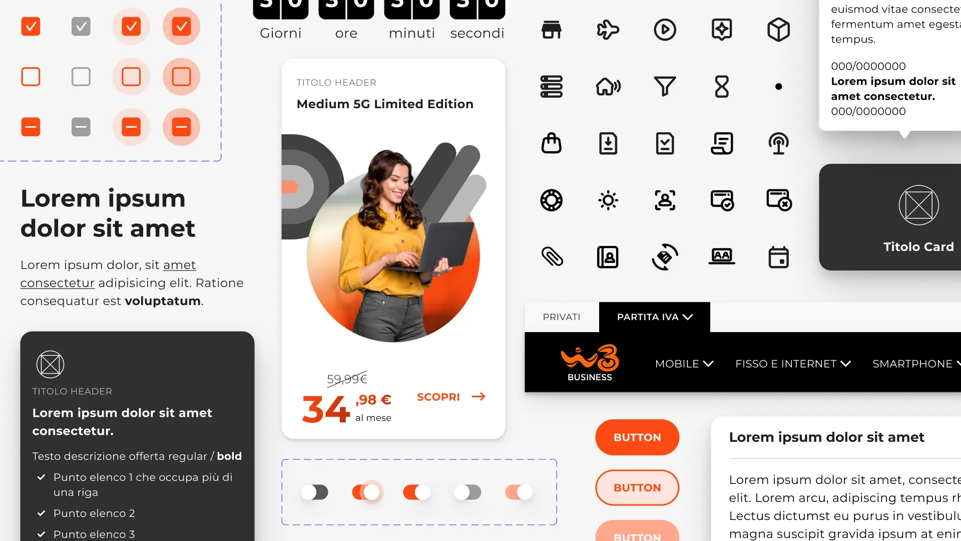
Every visual decision in this project had a job to do. Users needed to understand they weren’t talking to a standard chatbot, but to an AI agent that could genuinely hold a conversation.
The benchmark showed that most AI interfaces rely on the same visual language: sparkle icons, static gradients.
Animated gradients felt like the right call, on the background and on the agent’s output, because they tap into a visual vocabulary users already associate with AI, making the experience feel immediately familiar and credible.


Key features.
01
Animation with a purpose.
The gradient wasn’t just a background. Applied directly to the agent’s output, it tapped into a visual vocabulary users already associate with AI, signaling that something was being produced in real time. A subtle cue, but one that changes how users perceive what they’re talking to.
02
Giving the agent an identity.
Giving the agent a visual identity was a way to make it feel like something you’re actually talking to, not just a text box with a send button. The mascotte brought a personality to the interface, turning an abstract product into something with a presence.
03
Light and dark mode.
The interface was designed in both light and dark mode, not as a technical requirement but as a product decision. A B2B tool gets used in different contexts and conditions. Supporting both modes was a way to make the experience feel complete and considered.